A revolution is happening.
Go out onto the web today and you will see a wealth of data visualizations that are highly engaging and dynamic, with examples as varied as Mike Bostocks analysis of Oscar nominated movie trailers in the NYT to Uber Rides In San Francisco!
With the prevalence of public data sets available for anyone to go online and download, engineers and hobbyists alike are taking the opportunity to build creative and compelling views onto that data using open source JavaScript Charting libraries such as D3, Google Charts or Highcharts.
Conversely the enterprise approach to data visualization follows the Business Intelligence (BI) paradigm. IT Departments invest in BI technology to integrate, model and visualize their ever growing amounts of data. BI tools have always been defined by the data visualization components that they provide. Vendors come to market with a portfolio of predefined charts and graphs, and are always trying to one-up each other on who has the most engaging visualizations. The reality is quite the opposite though, rather than innovating and staying ahead of the competition, vendors are often playing catch up to their customer base, with a backlog of feature requests, for “another chart type”. The enterprise loses out, always being short changed on what they are able to provide to their users.
So what is this Data Visualization Revolution?
Savvy developers in the enterprise have caught onto the fact that they no longer have to miss out on this online trend and wait for the BI tools to catch up. They can take these open source libraries (or growing amount of commercially available tools) and start building equally engaging views for their business and become the data heroes in their organizations.
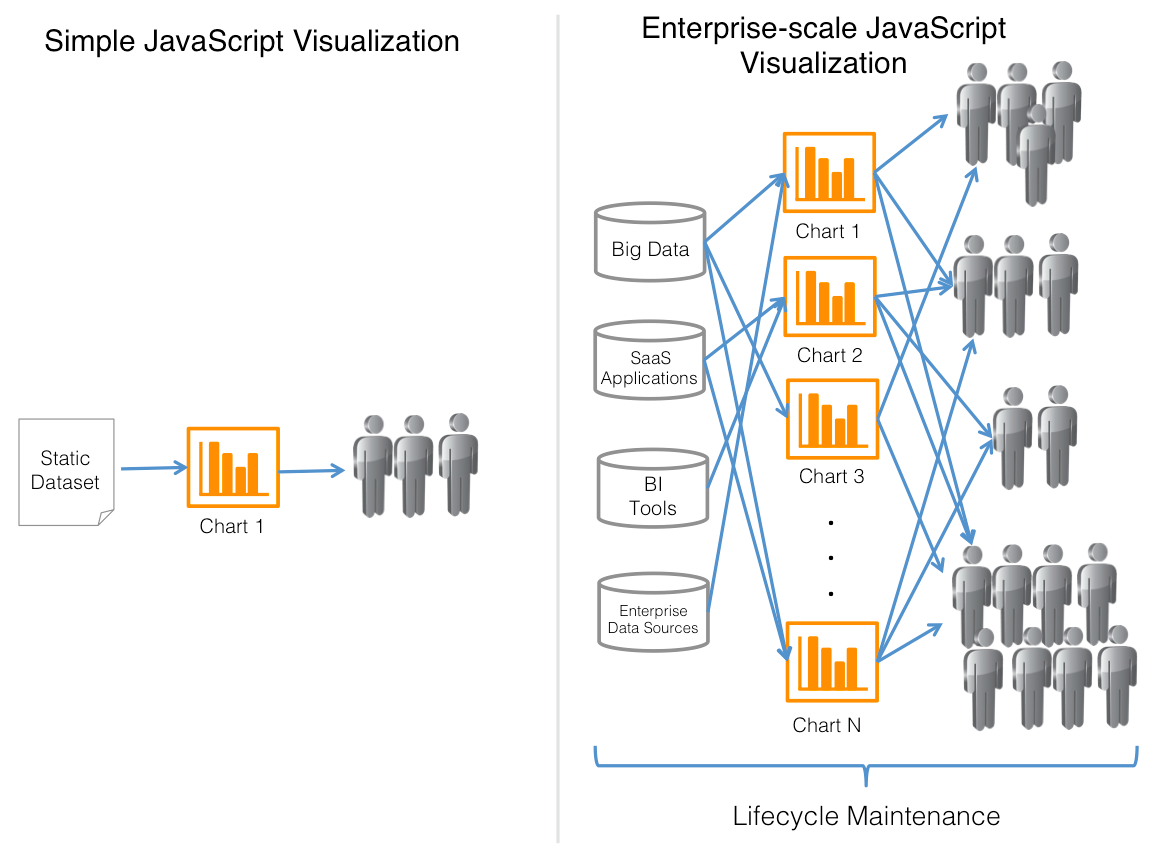
But there is a flaw. Getting one or two compelling charts and graphs out to their users is easy. Scaling that to an enterprise level whereby they are connecting to varied and dynamically changing data sources, building hundreds of charts and graphs and controlling deployment of those across the organization is extremely complex.
Why is this?
JavaScript Visualization libraries are, as the name would suggest, focused around the visualization of data. They are not focused around the collection, processing and formatting of that data in a way that makes it consumable for the visualization components. This in itself is not much of an issue when creating your one or two visualizations on that static data set that you downloaded, or that you exported from one of your systems. The savvy developer can code around it. But try scaling that to an enterprise deployment. Very quickly, the tasks around data plumbing and user management become unmanageable.
How Can You Scale Your JavaScript Charting?
The reality is that that the world of Push Intelligence and JavaScript Visualizations need to come together. The JavaScript developer needs a solution that can deal with the complexities of data collection, data caching and data delivery…he or she needs to be able to easily manage the distribution and access to those visualizations…and, with the changing nature of enterprises in general, have a way of managing the lifecycle of their environment.
With the joining of Push Intelligence and JavaScript Visualizations, enterprises no longer have to be constrained by their BI tools and the visualizations that they provide.
Sign Up Here for our Webinar on the 23rd January to learn more.
Click here to learn more about Metrics Insights JavaScript visualization solutions.